
Dérive: Jefferson Boulevard
This project explored using fundamental visual and graphic design practices - shapes, colors, typography, images, and composition - to translate the experiences, ideas, and thoughts of a journey exploring a physical place into a book that delivered this narrative through a designed, and ultimately printed, 2D visual format.
Fall 2021
Graphic Design & Visual Communications
Software: Adobe Illustrator, Adobe InDesign
01 PROJECT OVERVIEW
This visual communications project began with a dérive, a meandering walk through a physical environment. For my walk, I visited Jefferson Boulevard in the Oak Cliff neighborhood. My walk took place on a Tuesday evening in September. As I walked, I took in my surroundings, listened to the sounds of the street, documented the storefronts and business, and even paused to enjoy a meal.
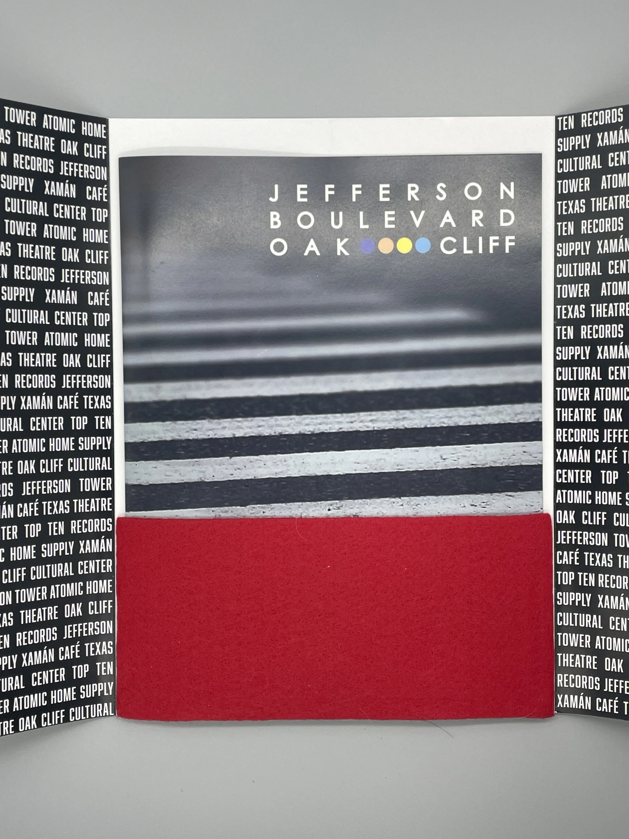
I translated my journey exploring Jefferson Boulevard into a story that captured my experience and brought to life the things I saw, touched, learned, and felt. As this project progressed, I explored the basic elements of graphic design: lines, shapes, colors, typography, images, and composition. The final result was a 20-page magazine-style book that tells a story of Jefferson Boulevard.

Exploring Jefferson Boulevard


02 GRAPHIC DESIGN ELEMENTS
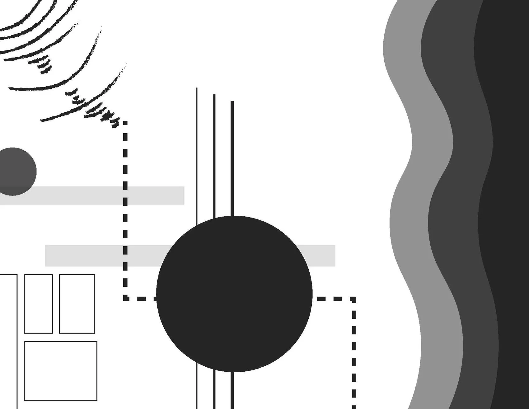
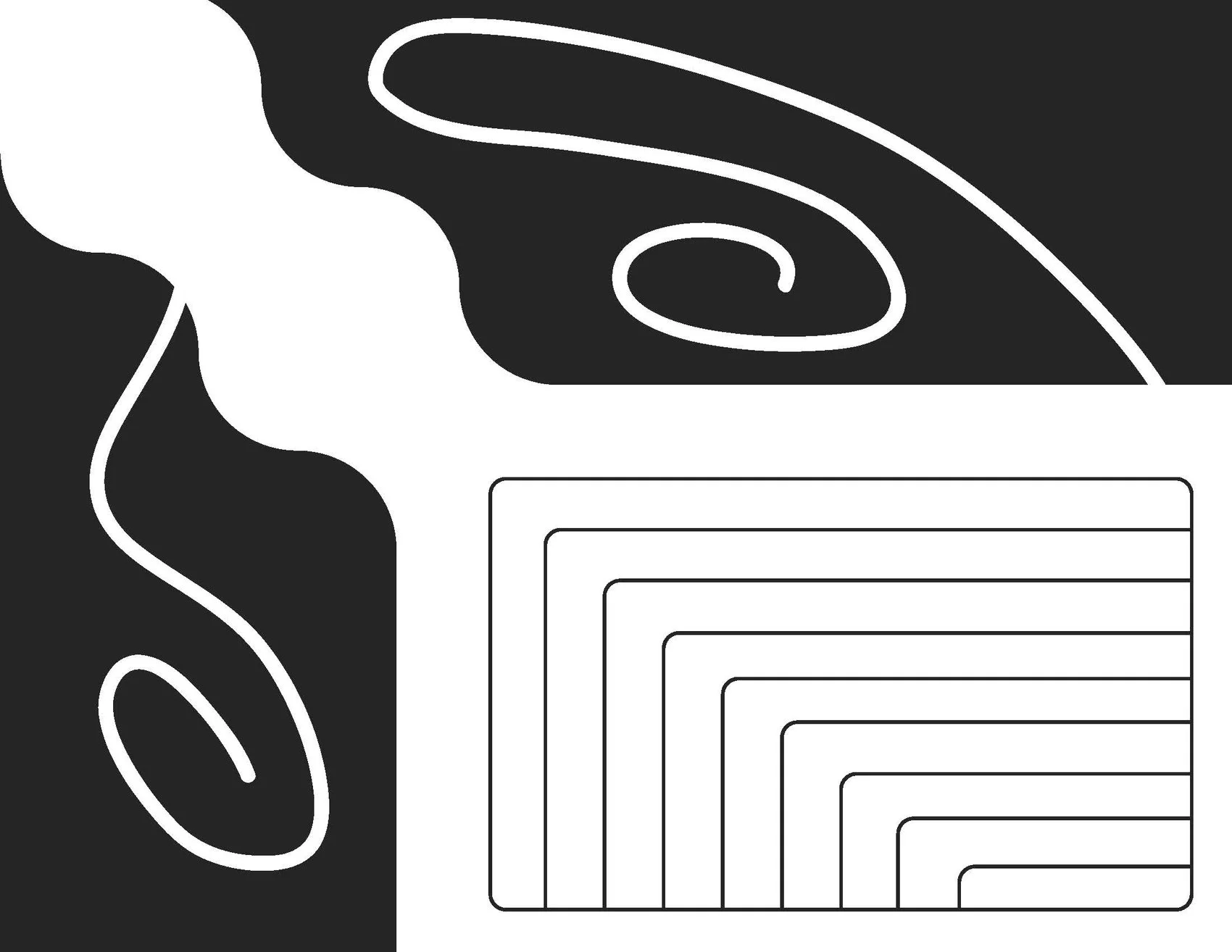
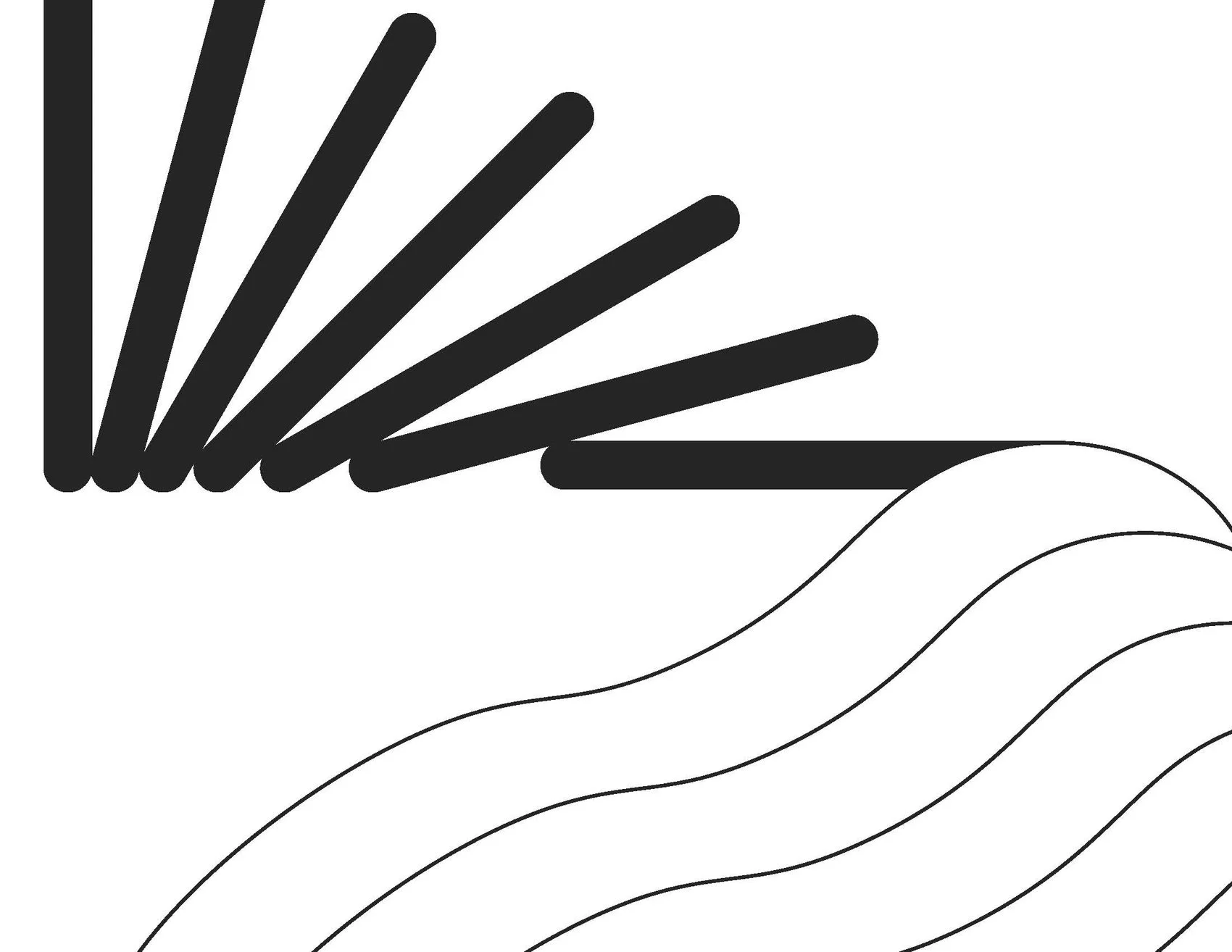
In the first phase of my design, I explored the relationship between basic design elements – dots, shapes, lines and planes – to communicate various emotions and specific aspects of my dérive.
I specifically explored my journey’s route and how I felt at the beginning, middle, and end of my journey.
-
![]()
My Route
-
![]()
Beginning - "Analytical & Anxious"
-
![]()
Middle - "Inquisitive & Purposeful"
-
![]()
End - "Exhausted & Accomplished"
03 TYPOGRAPHY & COLOR
After exploring basic graphical elements, I began to integrate typography and color into my design iterations. When exploring typography, I tried to not only spend time thinking about the specific words I was writing, but how the typographical treatment of those words conveyed different emotions. With colors, I began to really embrace the bustling and lively experience you get when walking down Jefferson Boulevard. The colorful and diverse storefronts bring this iconic street to life.


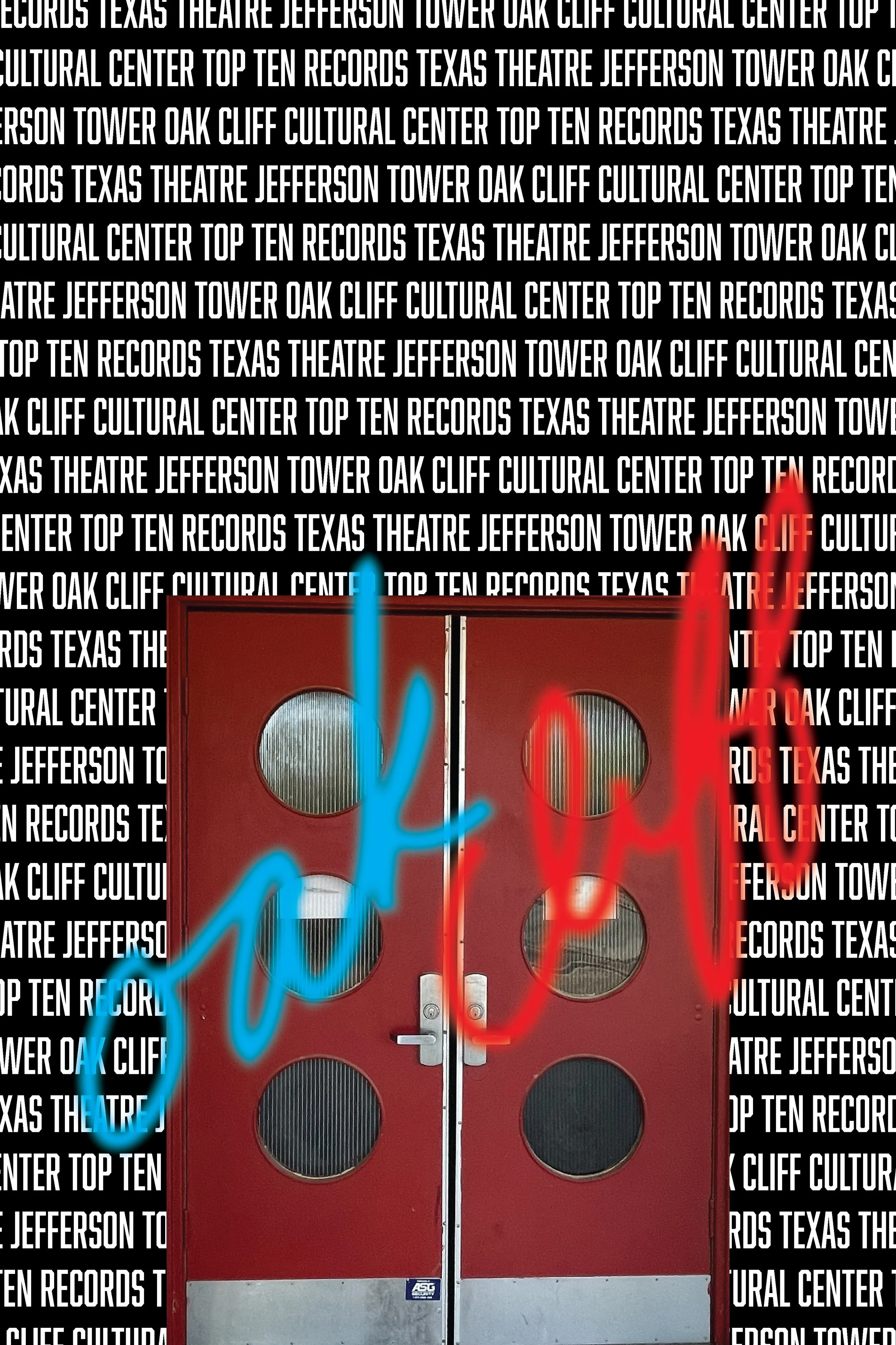
04 IMAGES & COMPOSITION
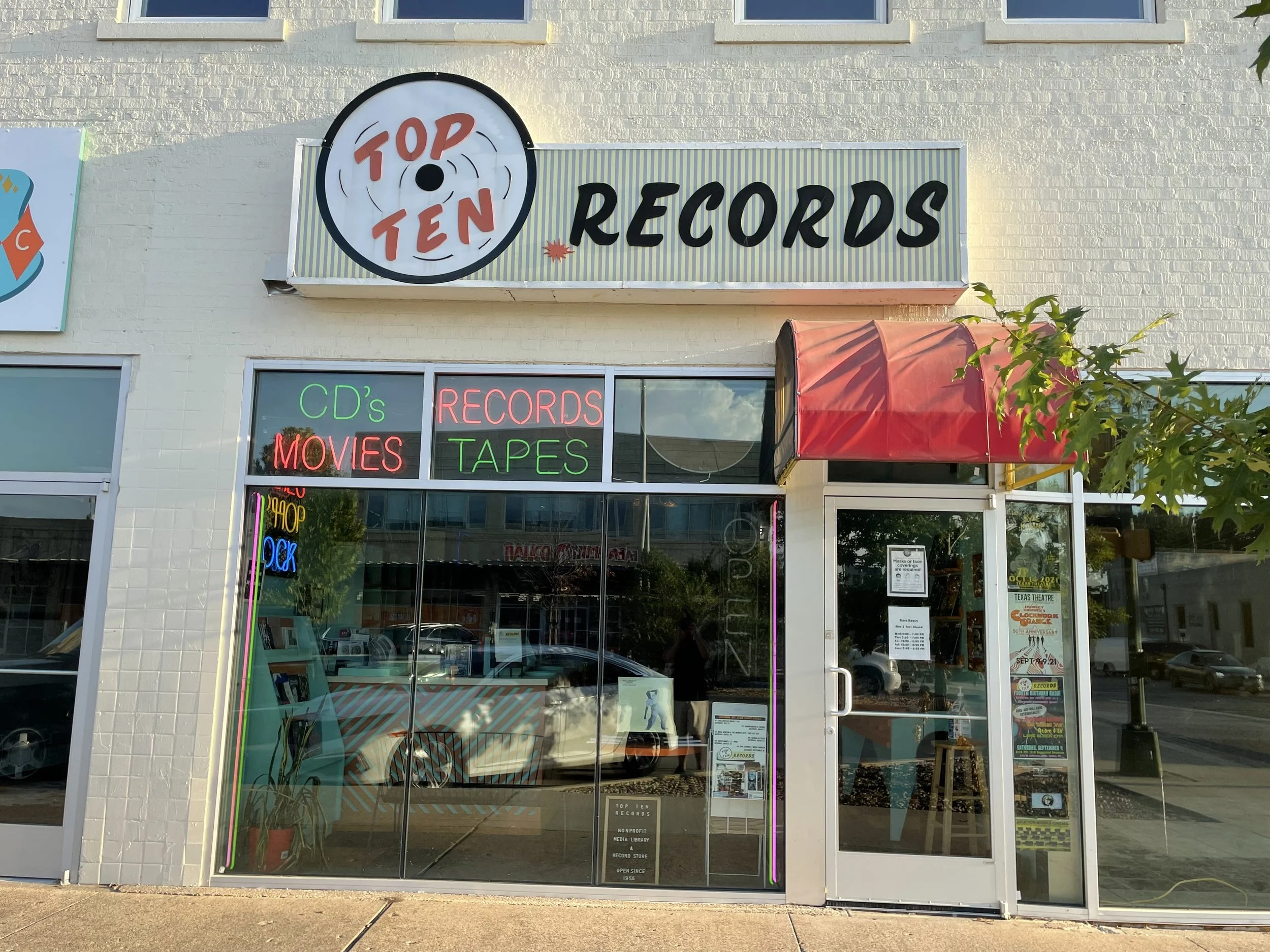
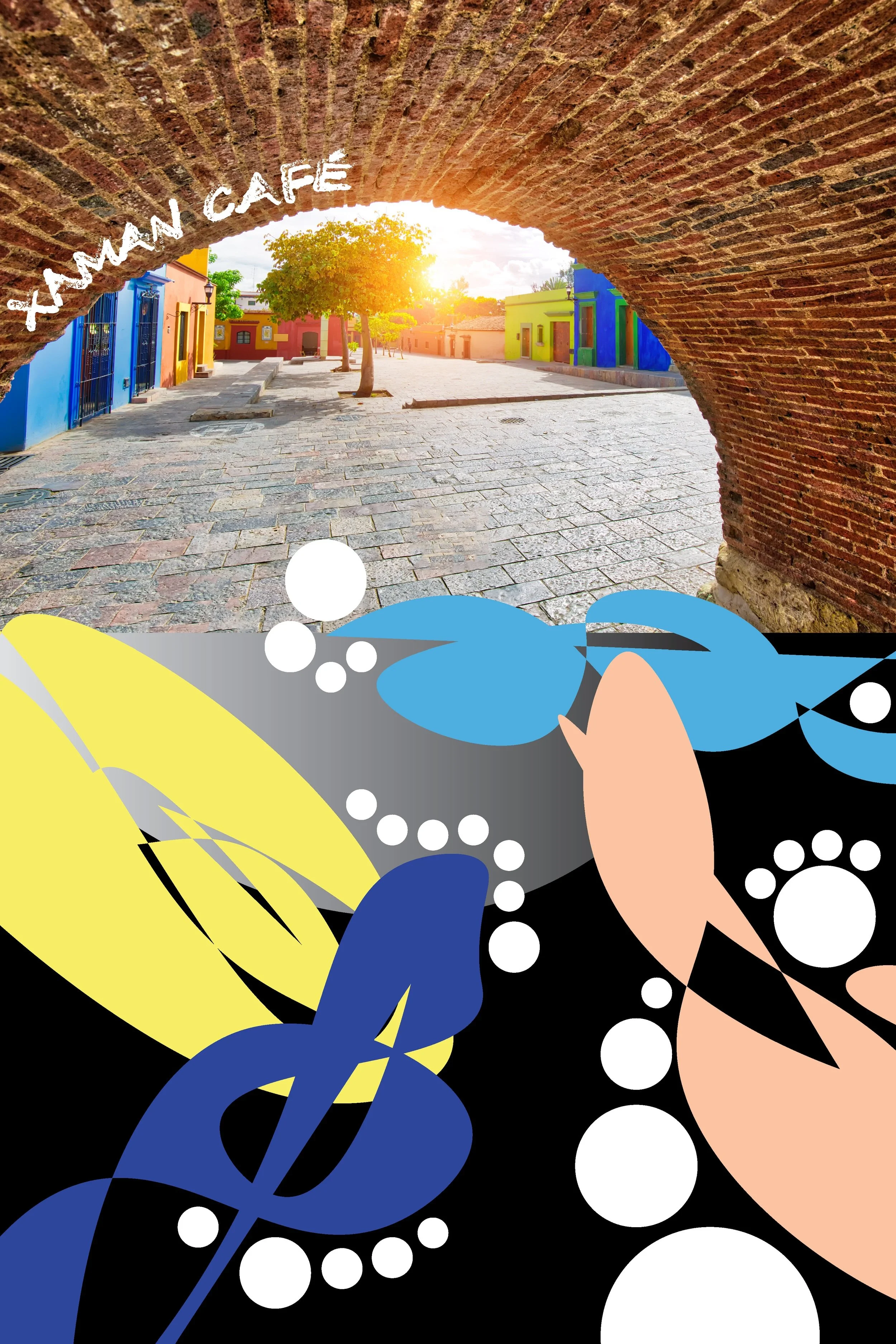
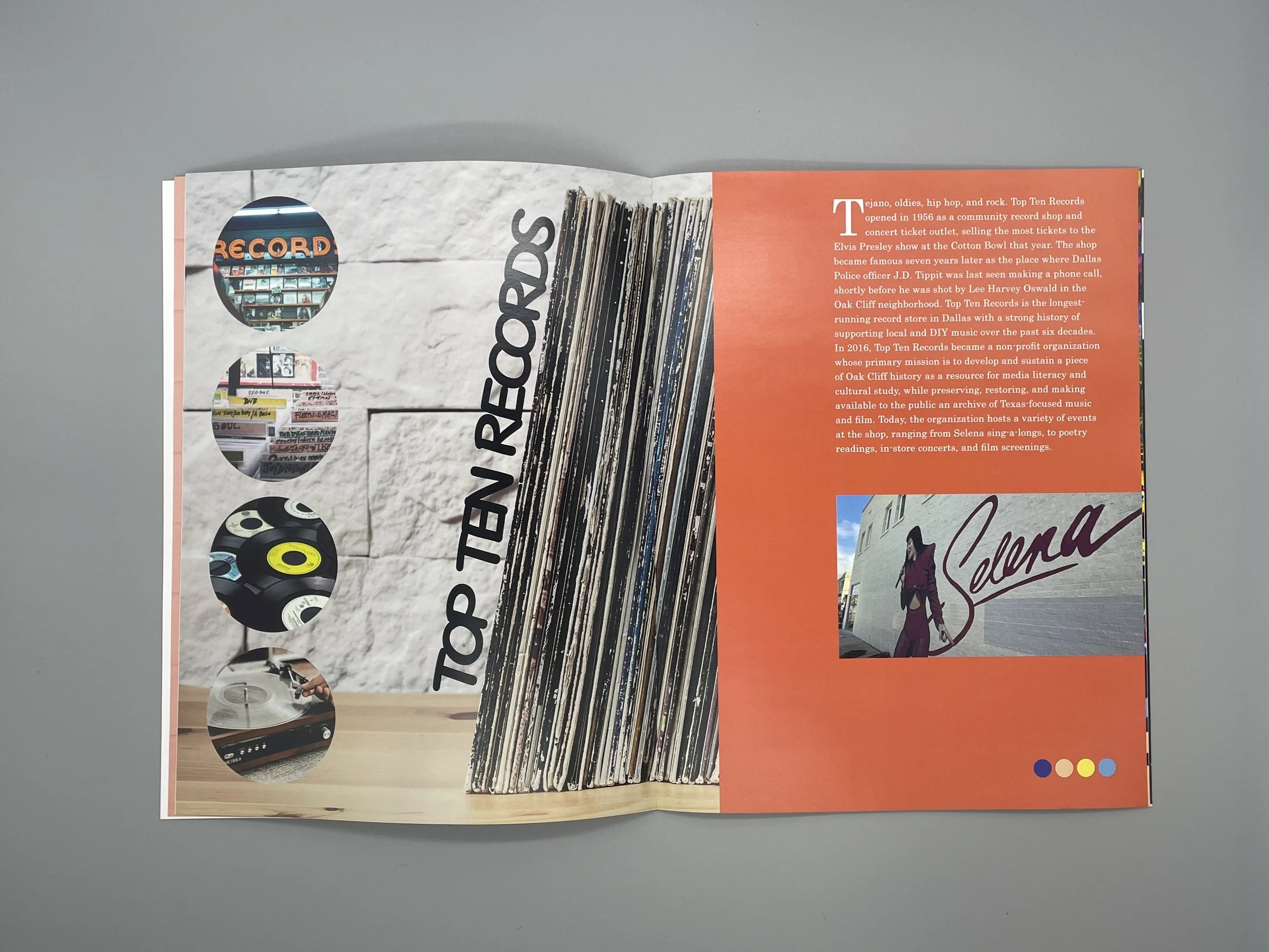
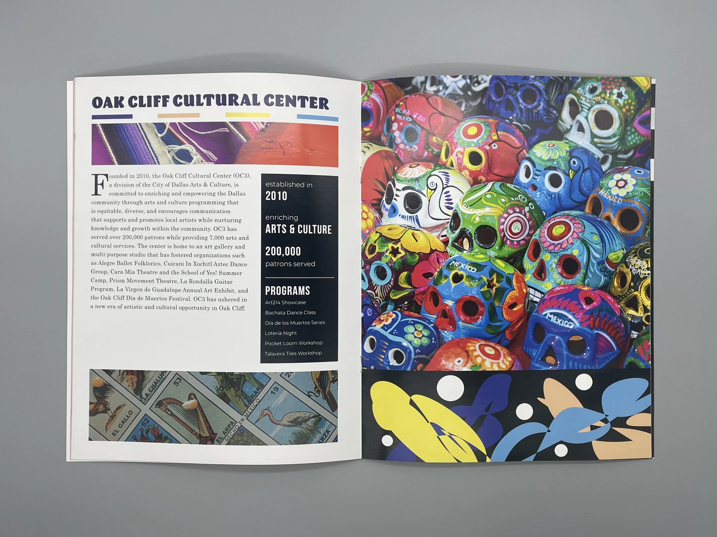
The concept of my final book really started to materialize when I began to introduce imagery into my design iterations. Combined with typography and color, adding images to my photos really began to give me more confidence in my designs and tell a more complete story of my Jefferson Boulevard experience and the individual locations I visited along my walk - Atomic Home Supply, Jefferson Tower, Oak Cliff Cultural Center, Texas Theatre, Top Ten Records, and Xamán Café.


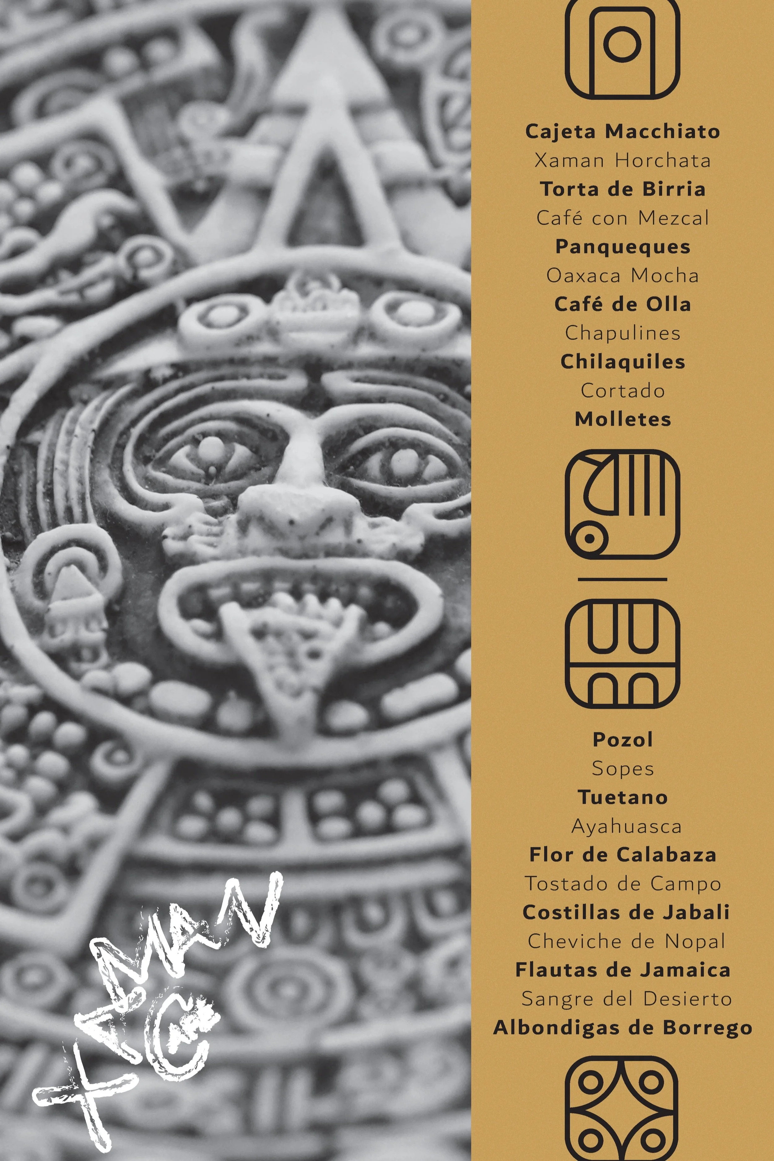

05 ICONS & INFOGRAPHICS
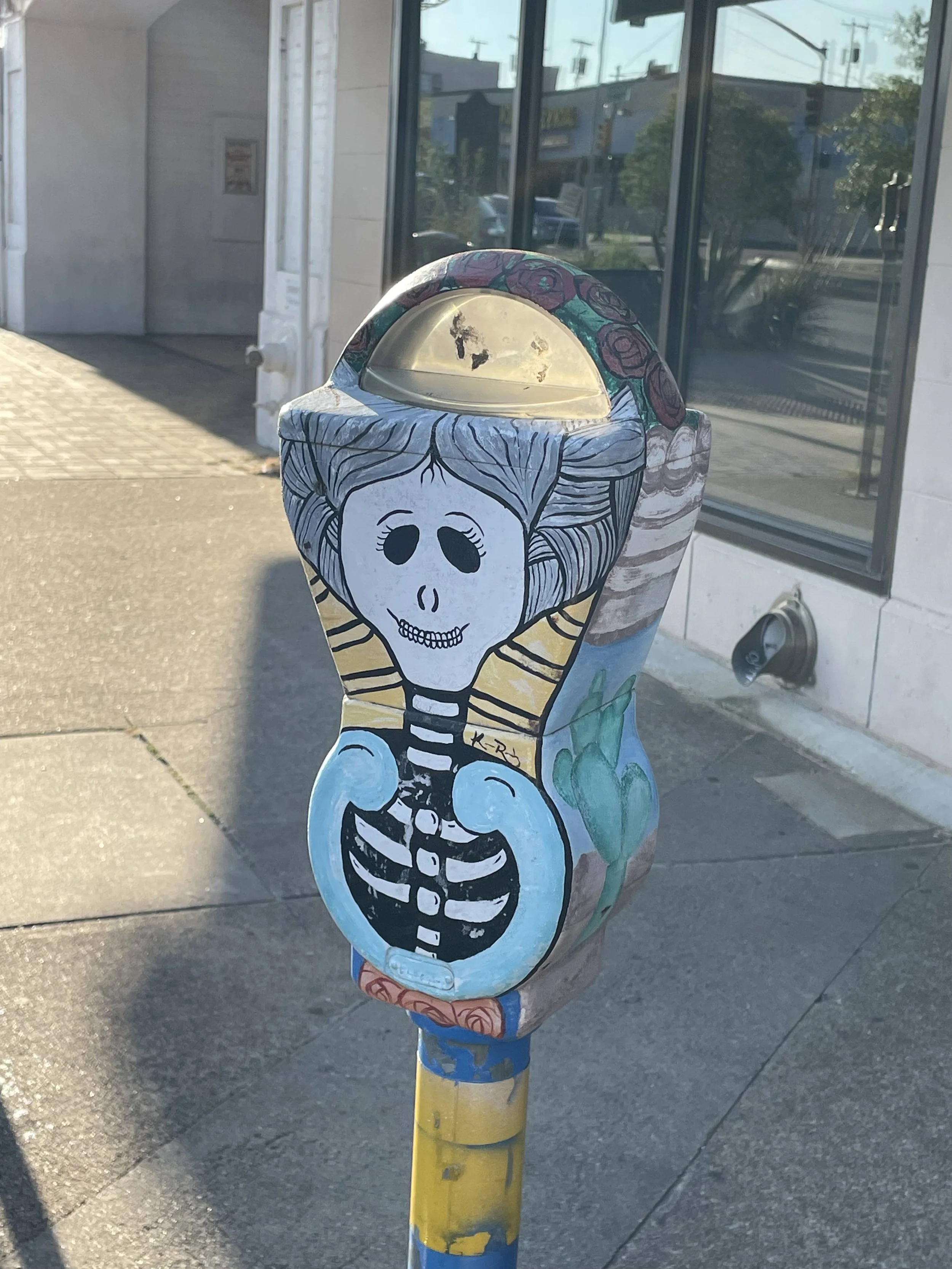
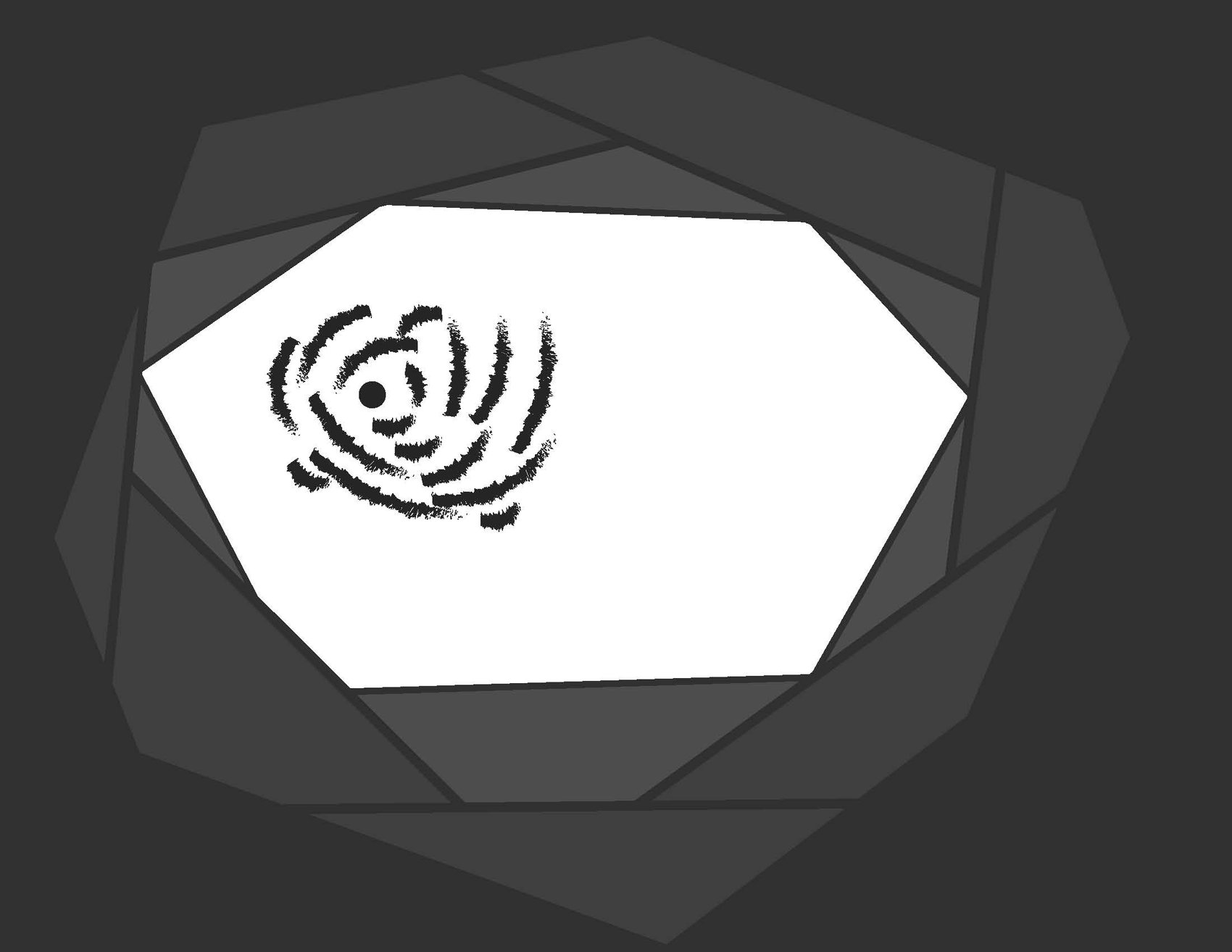
As we rounded out our exploration of graphic design, the final step was icons and infographics. These symbols help reinforce a message or simply communicate complex information. As I was positioning my final book design, I knew I wanted to create a “logo” that represented Jefferson Boulevard. I also documented the more tangible characteristics that help define a street like crosswalks, parking meters or bus stops.


Final Book Design


06 DÉRIVE: JEFFERSON BOULEVARD
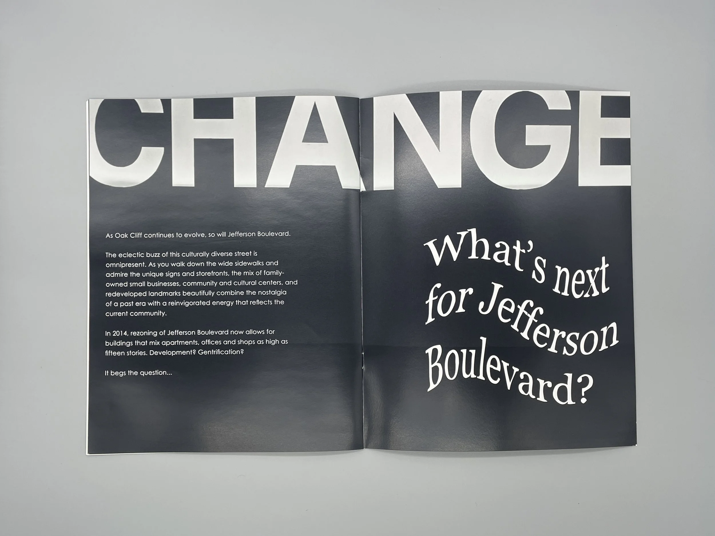
After 6 weeks of iterations and exploration, I blended my designs into a final designed book. The constant throughout the history of Jefferson Boulevard is change. Iconic venues like Jefferson Tower and the Texas Theater date back to the 1920s and 30s. In the 1950s, it invoked the feelings of Main Street, USA. After a period of downturn, today’s Jefferson Boulevard is being revitalized by family-owned businesses and cultural institutions that reflect the diverse neighborhood of Oak Cliff. Capturing this noteworthy history and ever-evolving story, I positioned my book as a promotional magazine that would interest visitors to Jefferson Boulevard and also ask the important question: What’s next for Jefferson Boulevard?
